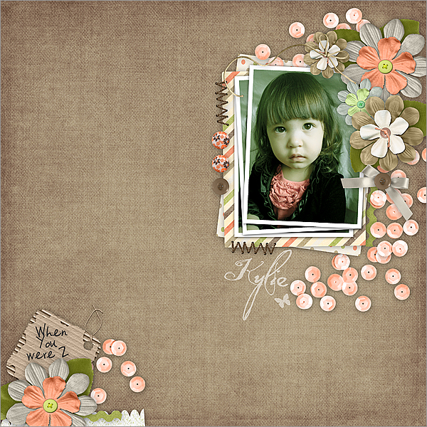
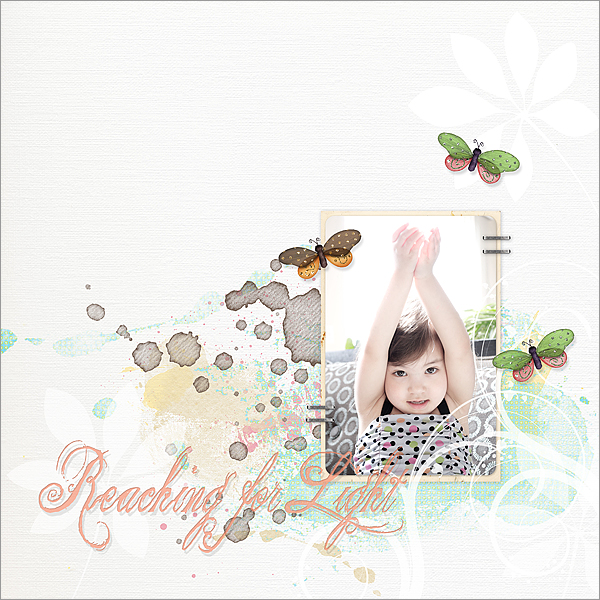
These two layouts were created for a couple of challenges at two different digital scrap forums but they are both on the subject of photography and editing.

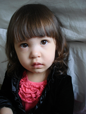
 For this layout, the photography challenge was photo editing. The original photo (left) was edited in photoshop and then used in the layout above. These were the editing done on the photo:
1. Adjusted color Balance to make it less pink and more yellow/blue.
2. Adjusted vibrance to tone down the strong colors.
3. Adjusted Levels to bring out more brightness.
4. Used high-pass to create a crispy image.
5. Used the dodge tool to brighten areas around face (on left side of image).
6. Used the healing brush to remove the fold behind her (from the bed she’s leaning against) and a small fuzz on her hair. You can’t even see the fuzz though in the before photo. It was so small.
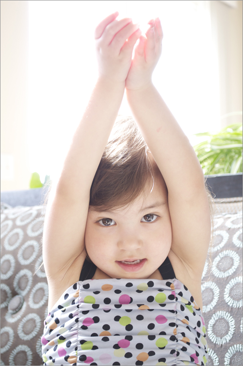
 This layout captures rim lighting. The editing on the photo (in the layout) were reducing vibrance and adjusting levels to blend in with the layout design. The original is below.
 Credits: for “When You Were 2,” I used the Tranquility kit by Roseytoes Designs. The fonts (Quilted Butterfly and Vaguelly Repulsive) are from dafont.com. For “Reaching for Light,” I used papers and elements from DeCrow Designs (Vanilla Cream, Amiable, and Summer’s Last Kiss) and Julie Bullock (butterflies and staples from Walk Softly). The font used was The King and Queen Font from dafont.com ♥
Leave a comment